
Architectural narrative – Chicago
JUST SAYING . . .
In my opinion, the architecture in Chicago is one of if not the best in the country. Certainly New York City has at skyline in Philadelphia has contemporary buildings within historical setting. San Francisco and Los Angeles also have distinctive buildings.
Chicago is one of the two places in the US that had tallest skyscrapers from the moment when the skyscrapers appeared and is considered to be the birthplace of the skyscraper because it was home of the Home Insurance Building, completed in 1885, the world’s first steel-framed skyscraper. From a photographers point of view Chicago remains high in the list because of the visual acceptability from the Chicago River. Take a look and see if you agree with me.
J. Wayne Oldroyd
“In our ‘cities within cities’ we shall turn our streets up into the air, and stack the daytime and nighttime use of our land.” —
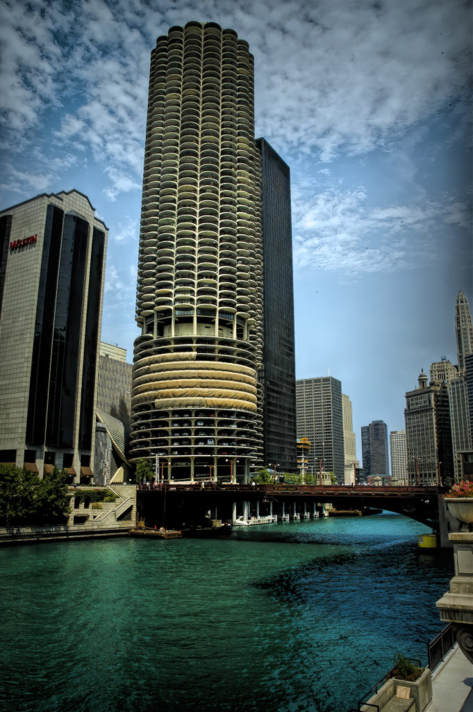
Marina City


Marina City
Downtown Chicago (sometimes referred to as the Loop) is now one of the fastest growing residential neighborhoods in the Chicagoland area. But downtown living hasn’t always been so trendy. When architect Bertrand Goldberg envisioned Marina City, it was an urban experiment designed to draw middle-class Chicagoans back to the city after more than a decade of suburban migration.
By creating a city within a city, Goldberg hoped the convenience of living and playing close to work would help make Marina City a success. After all, the mixed-use development was so much more than just those two “corncob towers.” When completed in 1967, it included two residential towers, plus an office building, a theater, parking for your car or boat and plenty of retail space. But were Chicagoans ready to move back to the city from the outlying suburbs
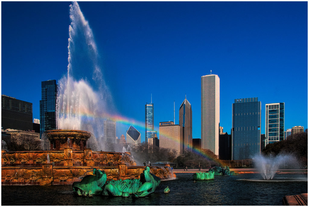
Two Prudential Plaza
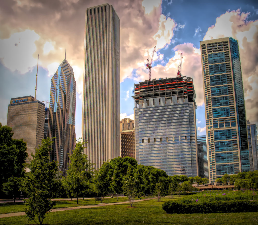

Two Prudential Plaza
Two Prudential Plaza was the world’s tallest reinforced concrete building at the time of completion and the tallest building constructed in Chicago in the 1990s.
Today it is the 13th-tallest building in the United States and holds mainly offices. It is connected to One Prudential Plaza, its sister building.
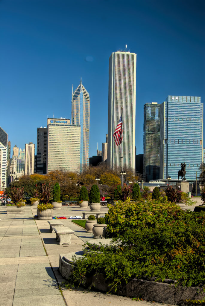

AON Building
Chicago’s third-tallest building stands out in Chicago’s skyline, distinctively different from its steel-and-glass peers. Its history is rather more colorful than the stark white stone in which it is clad. n the late 1960s, the Standard Oil Company of Indiana wanted a consolidated downtown Chicago headquarters. With a prominent site at the head of Grant Park (vacated by industry), their building needed to be monumental. The company hired Edward Durell Stone, whose unique brand of Modernism was then in vogue; his Kennedy Center would open in Washington, DC, in 1971. When the tower opened in 1973, it was the second-tallest building in Chicago and the world.


NBC TOWER
NBC TOWER IS ONE OF THE BEST examples of postmodern architecture, influenced by Art Deco architecture in its design and serves as a landmark for Chicago. Located at Cityfront Center, a multi-phase, 50-acre development conceived as a link between Chicago’s Near North Side and the Loop. Guided by a desire for neighborhood improvements that would benefit business tenants, residents and pedestrians, the tower is thoughtfully integrated within the Magnificent Mile.


THE WRIGLEY BUILDING HAS BEEN CONTINUOUSLY FLOODLIT SINCE ITS COMPLETION, WITH THREE EXCEPTIONS: DURING WORLD WAR II, AMID A PROJECT TO REPLACE THE LIGHTS IN 1971 AND DURING THE ENERGY CRISIS OF 1973-74.
Wrigley Building
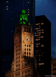
The Wrigley Building is so recognizable, it hardly needs an introduction.
It stands proudly where Michigan Avenue crosses the Chicago River, a luminous white beacon known the world over as a beloved symbol of Chicago’s preeminence in architecture and commerce.
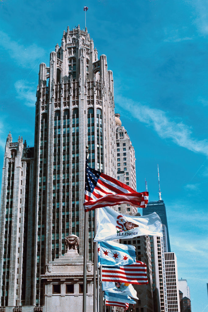

When Michigan Avenue was extended north of the river, it opened up a gritty landscape of small buildings and industry to a complete transformation. Chewing gum magnate William Wrigley Jr. touched off the boom when he decided to build a new headquarters for his company on an oddly shaped lot west of Michigan Avenue and just north of the river. It was the first, and quite possibly the finest, of the buildings that have come to define the Magnificent Mile.
One of the important features of Daniel Burnham’s 1909 Plan for Chicago was to widen Michigan Ave. (formerly Pine St.) north of the river, and construct a new bridge to connect the roadway on both sides of the river. The Wrigley Building, whose bell tower is styled after the Giralda Tower of the Seville, Spain cathedral, consists of twin structures clad in white terra cotta and was the first skyscraper built on the new grand boulevard.
Such a prominent site demanded a notable building, and architects Graham, Anderson, Probst & White delivered. Modern in its height and steel-frame construction, the Wrigley Building’s facade nonetheless bears the weight of history. As a young man, Wrigley visited the World’s Columbian Exposition in 1893 and never forgot the famed White City or its nighttime light displays. Those memories live on in his namesake building. Six different shades of gleaming white terra cotta become brighter as the building rises, and its facade is illuminated at night.
A second tower was commissioned shortly after the completion of the first, presenting a harmonious front to Michigan Avenue. The two buildings are linked by a third-floor bridge. They’ve been immaculately maintained since completion with regular cleanings to keep them sparkling white. A thorough restoration followed the Wrigley Company’s recent sale of the building, and it received official Chicago Landmark status in 2012.
One of the important features of Daniel Burnham’s 1909 Plan for Chicago was to widen Michigan Ave. (formerly Pine St.) north of the river, and construct a new bridge to connect the roadway on both sides of the river. The Wrigley Building, whose bell tower is styled after the Giralda Tower of the Seville, Spain cathedral, consists of twin structures clad in white terra cotta and was the first skyscraper built on the new grand boulevard.
In the Midwest size matters
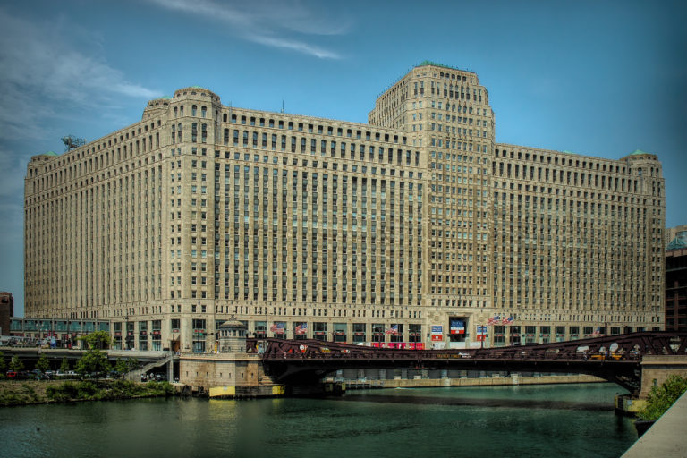
The Merchandise Mart (or the Merch Mart, or the Mart) was the largest building in the worldin 1930, with 4,000,000 square feet (372,000 m2) of floor space.The art deco structure is located at the junction of the Chicago River’s branches. The building is a leading retailing and wholesale destination, hosting 20,000 visitors and tenants per day as of the late 2000s.
Built by Marshall Field & Co. and later owned for over half a century by the Kennedy family, the Mart centralized Chicago’s wholesale goods business by consolidating architectural and interior design vendors and trades under a single roof. It has since become home to several other enterprises, including the Shops at the Mart, the Chicago campus of the Illinois Institute of Art, Motorola Mobility, and the Chicago tech startup center 1871.
The Merchandise Mart is so large that it had its own ZIP code (60654) until 2008, when the Postal Service assigned it to part of the surrounding area.
The Thompson Center was designed by Helmut Jahn of Murphy/Jahn now called JAHN Architects. It opened to mixed reviews by critics, ranging from “outrageous” to “wonderful”. The color of the street-level panels were compared to tomato soup. The 17-story, all-glass exterior curves and slopes facing a plaza on the southeast corner of the property. The design simultaneously looks forward with advanced architectural tectonics (of the time) and back to recapture the grandeur of large public spaces. Visitors to the Thompson Center’s interior can see all 17 floors layered partway around the building’s immense skylit atrium. The open-plan offices on each floor are supposed to carry the message of “an open government in action.
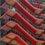
J. R. Thompson center
When you first encounter the Thompson Center, you might wonder if a UFO has landed in the middle of the Loop.
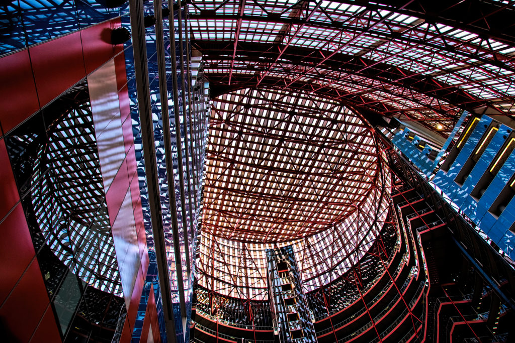
The Helmut Jahn-designed center of state government is unabashedly Postmodern, with colorful details and a shape that references the dome of the state’s capitol. In addition to making a bold first impression, its design is intended to communicate a message. The openness and transparency of the building are meant to symbolize the state’s commitment to serving the people.